
A bold, feminine, and sophisticated campaign that captured Glowbloom’s radiant personality through color, composition, and artful direction.
Creative Strategy + Art Direction + Photography

Overview
Glowbloom Cosmetics was preparing to launch exclusively at Sally Beauty, a retailer known more for haircare than cosmetics. My role as Creative Director and Photographer was to guide the brand's creative strategy and visual direction to establish Glowbloom as a credible, trend-driven beauty brand within an unexpected retail environment. The goal was to craft a cohesive image library that captured Glowbloom’s bold, feminine, and adventurous identity while establishing the visual style guide for photography. I provided end-to-end creative leadership, from strategy development and moodboard creation to photography, set design, and post-production. Deliverables: Creative strategy and brand imagery library.


Objective
Position Glowbloom as a trend-forward, accessible beauty brand with visuals that communicate energy, femininity, and confidence. The imagery needed to surprise and delight the Sally Beauty shopper while conveying credibility, style, and value.


THE Strategy
The client envisioned a bold, feminine aesthetic with a playful edge. To bring this to life, I led a strategic discovery process that included detailed questionnaires, in-depth discussions, and visual alignment sessions to clarify the brand’s goals, audience, and desired tone.
We defined Glowbloom’s target audience as women aged 15–30 who are beauty-savvy, value-driven, and trend-conscious. From this insight, I shaped a brand strategy that balanced retro sophistication with a fresh, youthful energy. The visuals needed to evoke curiosity, spontaneity, and a sense of creative adventure.
Drawing from these insights, I developed a cohesive visual framework positioning Glowbloom as a vibrant, approachable brand with strong aesthetic credibility and emotional appeal.
The Process
Building on the insights from our strategy phase, I developed four distinct creative direction concepts to bring the vision to life:
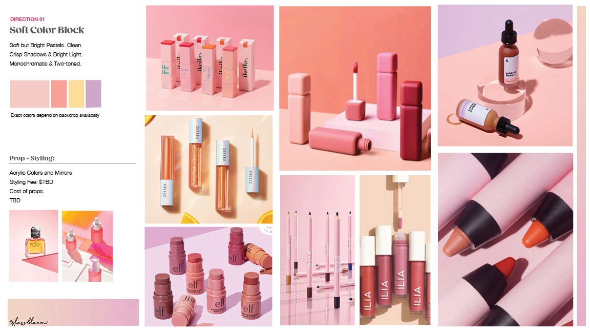
Soft Color Block: Clean, crisp compositions using soft pastels and controlled light.
Vibrant Gradients: Punchy, gradient backdrops echoing packaging tones for an energetic, editorial feel.
Floral Bloom: A romantic, sophisticated direction introducing texture and life through florals.
Vintage Texture: Retro-inspired color and props that added warmth and familiarity.
Each concept explored a different facet of the brand’s personality—from playful and adventurous to polished and feminine—offering the client flexibility to test what best resonated with their target audience.


The Execution
After reviewing the creative directions with the client, we refined and combined elements from the strongest two concepts, Vibrant Gradients and Soft Color Block. These became the visual foundation for the campaign.
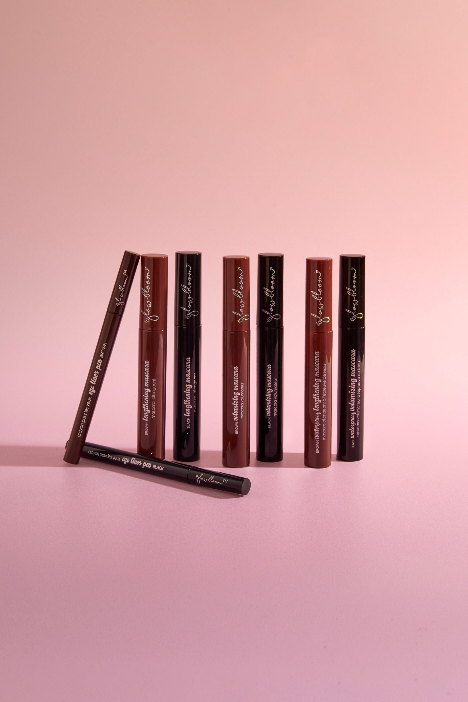
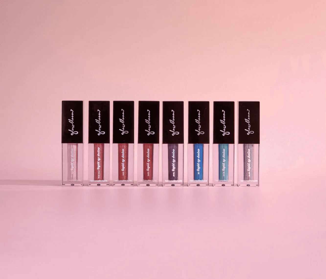
I led the full production process, including art direction, photography, and retouching. I designed custom gradient backdrops to match product packaging, styled acrylic and mirrored props for modern reflections, and maintained tight control over lighting and color to achieve a clean, cohesive look across the image set.
The resulting imagery reflected Glowbloom’s optimistic personality while maintaining a professional polish suitable for retail, e-commerce, and advertising applications.


THE feedback
The client was thrilled with the results and expressed genuine enthusiasm for how the imagery brought the Glowbloom brand to life. They noted that the visuals perfectly captured the brand’s adventurous, playful spirit while aligning seamlessly with its value-driven positioning. The final assets exceeded expectations, striking the ideal balance of sophistication, vibrancy, and accessibility that defined the campaign’s success.


